Illustrated Guide to Black & White Processing
My Scan Workflow, for the Manual Focus Forum
© , 2006. All images and text are property of the author and are not to be duplicated or reprinted without permission.
There are a million way of scanning & processing images, and a million opinions about which one is best. Here I will make a step by step guide on how to do it to maximise the quality, but also stay economical with computer disk space and processing time.
Support this tutorial. Click the ads
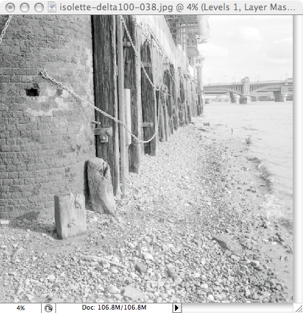
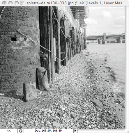
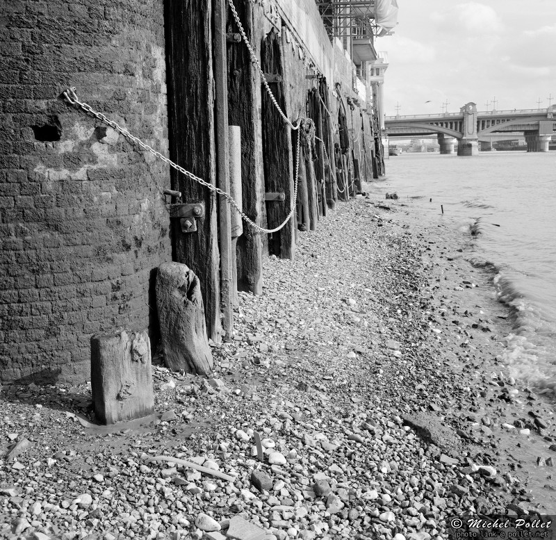
Here is the resulting image. This was taken with a 1954 Agfa Super Isolette on medium format Ilford Delta 100, processed in Barry Thornton 2 bath formula to maximise the negative tonal range.
Lets start with the scanning by itself. I will not describe this in too many details since it is dependant on the scanner and scanning program, suffice to say that I start by scanning as a positive image with zero correction. I disable every checkbox and option the scanning program might think I need. I take control!
I just make sure I adjust the black & white point in the level dialog to encompass all the tones present in the film (with a tiny margin for luck)
Note that editing the histogram when using the "reduced" or "thumbnail" view can create problems : the histogram will only show you the tones of what is visible at that size, but if you have small details with highlights or deep blacks in the negative they might not be visible at that size. So it is a good idea to make a higher resolution preview then set the black & white points.
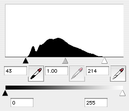
Negative as shown in Epson Scan, and the Histogram with White & Black point set
I scan at 4800dpi (the highest optical resolution supported by the scanner) but my target size is 2400dpi. I also scan in 8 bits, and save the image as a high quality JPEG. I know that most people would scan at 2400dpi in a 16 bits TIFF file, but my method will give you better results AND less noise -- and a much, much smaller work file.
A scanner samples the image at intervals, and has a constant noise/signal ratio. So when you take one sample for 2400dpi, you have 4 times the noise rate than if you take 4 samples (4800dpi) and average them. The average is literaly a "free" "multiscan" of the same area, when you use PhotoShop later to do the resizing the 4 original values will get averaged for a much nicer result. Also, any "banding" you might have introduced when proccessing the image at 4800 dpi size will vanish in the resulting image due to the resizing.. (More on that later on). And of course there is always the chance that the 4800dpi scan will pick some more fine details in the negative too...
If the scanner program knew of to write JPEG2000 I would of course use 16 bits file storage, but right now a 8 bit JPEG at 4800dpi is fantasticaly smaller on disk than a 16 bits TIFF at 2400dpi for an image that will be better in the end anyway, so don't waste your disk space with TIFF.
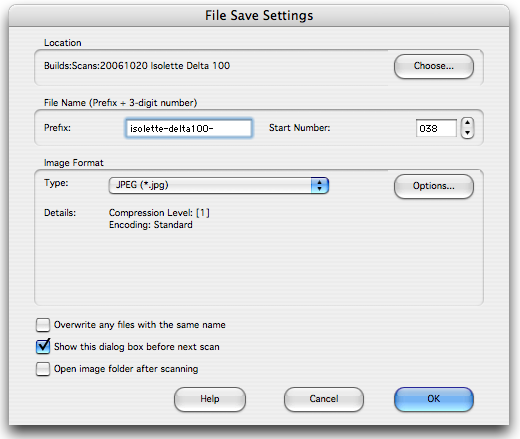
Writing a JPEG file directly from the scan program, save heaps of disk space
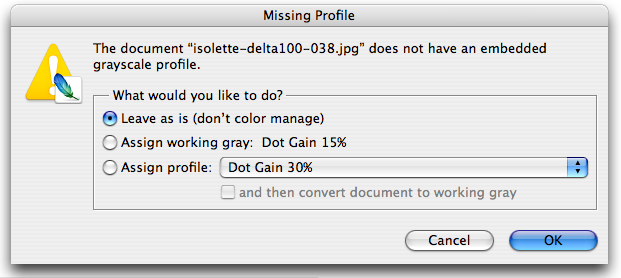
Now, in Photoshop I open the file and am presented with this dialog; the file I opened is a monochrome JPEG so I don't have the "wide gamut" profiles I would have used for a color film scan.
The best setting for now is to select "Leave as is" -- or use what the scanner program embedded into the file, if the software know how to do it. I do not try to assign/convert anything at this point, it is done later.
And this is what I get. Note that the histogram is nice and clean, I got all the tones I wanted out of the scan, this is all that matters!
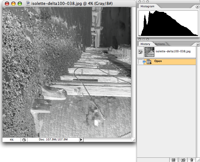
Raw Negative in Photoshop with a nice histogram
Lets reposition the image, and do the first operation on it. Rotate/Flip + Invert to get the first real view of what the negative contains. This is always very exciting to see the "real photo" for the first time. You can see that the Dmax is massive for such a scene, just out of the box. I call this two bath system "HDR for Black and White" (High Dynamic Range)
Note that the contrast is low because I worked hard to get as much as I could in the file when I set the white/black point in the scanner program, it is more important to get all the tones that getting the "looks" at this point; it is all that matters for now.
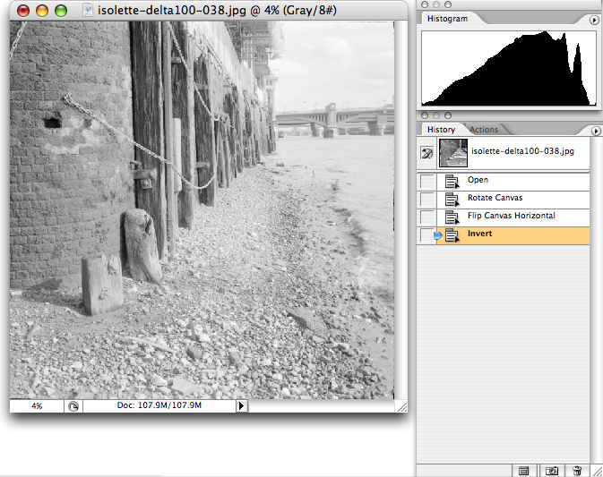
First view of the positive image
Now is a good time to crop/rotate/align the horizon if needed; here I just removed a tiny margin on the border of the image where some of the film mask was showing. It is important to remove this borders to make sure the black & white point we will pick later are in the image itself, and are not derived from something in the image border.
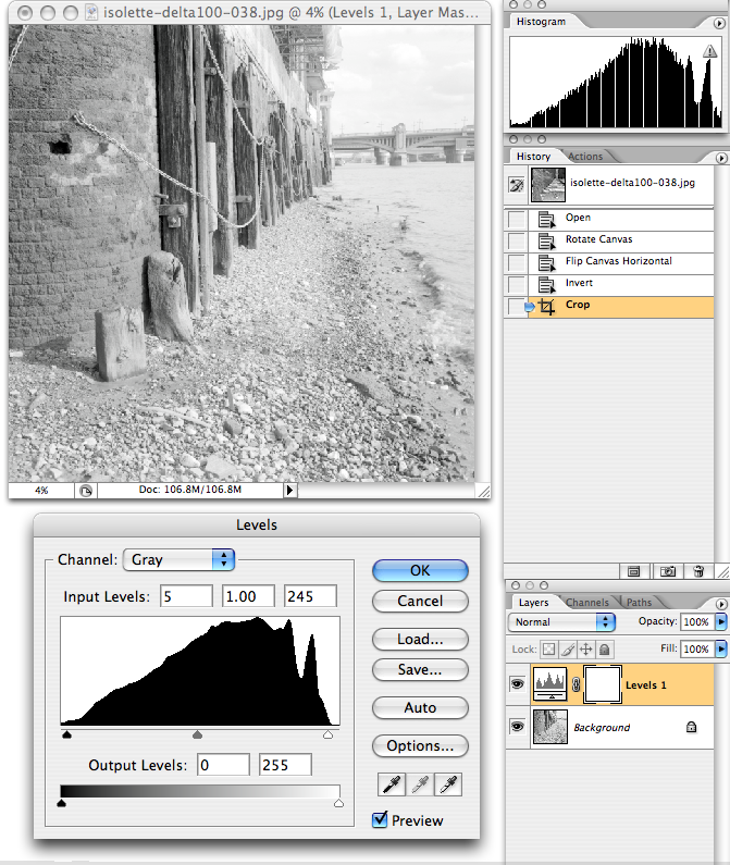
Creating the "Levels" layer and selecting "Auto"
Immediately afterward I create the first "Effect Layer" with a "Levels" layer. I also immediately click the "Auto" button that will realign the black and white point in the image to the maximun that is present in the image. In this case, the image immediately gain a bit of contrast.
The reason I use the "auto" levels is to make sure that the image on the screen will have "black" and "white" set properly, since we are going to choose the contrast next, having the wrong black/white point would make things impossible later. Of course, you can set the points manualy if you feel "auto" is wrong, but in most cases in most scenes, it does the right things...
Important: For the same reason, do not try to adjust the image further, and do not move the gray point, it is not relevant for now; only the black & white point needs to be arranged.
A note on Corrections, Grain, Noise etc
Now you must know that any change you make to levels, contrast or luminosity on an image enhances first the noise and the grain. This is a fact, there is no way around it. So when processing an image you must try to do so with the minimal amount of operations, this will guarantee you keep the noise/grain level under check.
On all the other "workflow" I've seen, at this point you would have people play with the gray level or introduce a rather complicated "Curve" with plenty of points and a shape that makes you seasick by just looking at it. The more complicated the curve, the more grain/noise will get introduced, and the resulting image is often dreadful to look at close range; that and the "banding" that gets introduced (tones that were close but different collide to just one).
The "Next Big Thing" I will describe here is documented nowhere, it involves using a "color" profile to change the apparent level of contrast/gain in the image. It is very interesting to use this method because it changes the contrast of the image on the screen, but doesn't change anything in the image at this point, the pixels are not changed at all; therefore the grain/noise level stays exactly as it was.
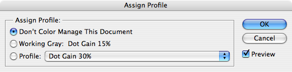
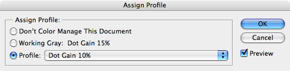
There is already a good selection of existing "display profiles" in photoshop, lets explore them a little.
Photoshop menu "Edit", item "Assign Profile...". This is what is the current one, for the image we have on screen with our "Level" layer.
Now, just click on "Profile" and select the 10%
Here is what you see when changing the value for the "Profile" popup menu:
Dot Gain 10% |
Dot Gain 15% |
Dot Gain 20% |
Dot Gain 25% |
Dot Gain 30% |
There we are; You can see I could either reduce the contrast, or enhance it a bit depending on the original negative density. For this image I picked the "25%" to get a touch more contrast, without loosing the details in the shadow (the wood near the top get a bit blocked up with the "30%" one. It's still a tad flat (more on that later), but it's a lot better. Now finaly, I can apply some curves... |
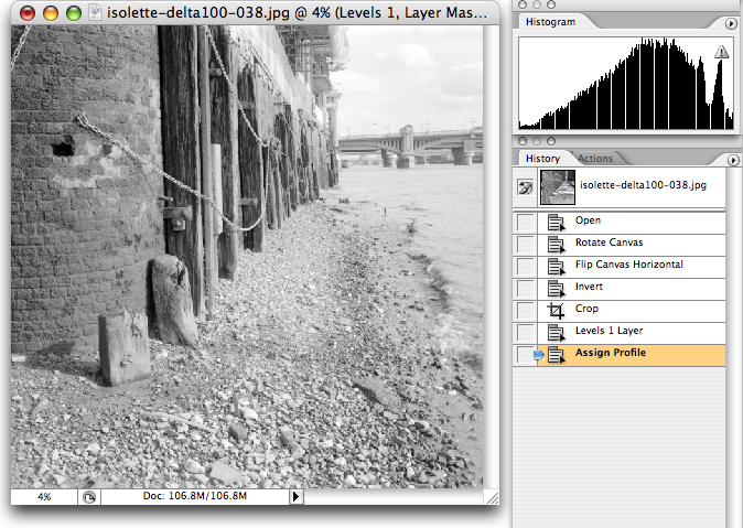
Image after changing the display profile
I create a new "Curves" effect layer to add a bit of contrast; note that the curve is extremely subtle, no heavy handed modification of the tones needed here, but it's still a bit too much for my taste. I will also add more local contrast later on on the process so I don't want to overdo it at this stage. So this subtle curve will do, and I will tone it down in the next step.
I often use this particular curve, and "Load" it when needed. Note that it is a LOT simpler and cleaner than most heavy duty curves you will usualy see in photoshop tutorials, the fact I used a profile to enhance the apparent contrast helped a lot. Remember that less corrections means less grain/noise.
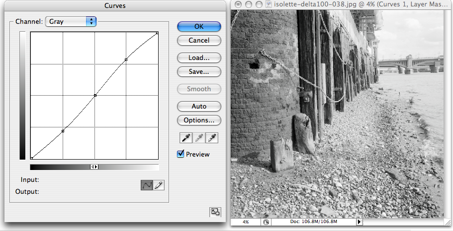
Basic "Contrast" curve preview, a bit too much...
There we are, we have the original "Levels" layer, and the "Curves" we are adding.
Next I "tone down" this contrast curve. The "Opacity" slider for the contrast layer is nice and precise; it is a lot more precise to do it that way than trying to do it by fiddling with the curve itself. Here I reduced the curve impact by about half.
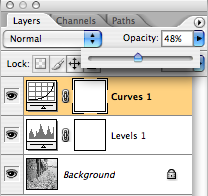
Opacity slider to control the contrast
Now I have the tones I wanted. This is my "I'm happy" image. Note that I haven't changed one pixel of the image since the "crop" step, and the effects layers we have added are very subtle. The next steps will now be made to "commit" the changes I made into a final image.
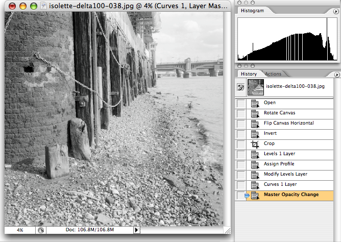
The tones I wanted, without changing one pixel
Firstly, I have to switch the image to 16 bits. I didn't need it before because I wasn't doing any "math" on the pixels; just simple operations (Invert is non destructive, and "crop" has no effect on the remaining pixels). The other steps didn't change a thing about the image underlying pixels.
But now, I need to go toward the final image, so I need to convert the image to 16 bits before I start touching the pixel values. This is very important to do it now. Of course I could do it right at the beginning if I wanted, but 16 bits images are slow to manipulate, and the curve/level refresh rate is significantly slower.
So, convert the image to 16 bits.
Next, I "Flatten" the image; this will tell photoshop to "apply" the levels & curve layers I have selected to the 16 bits pixels source (thus with a lot more precision than 8 bits) and create the resulting, "flat" image.
Next, I will "downsample" the image to it's target size. The image is reduced by half to bring it down from 4800dpi to 2400dpi. It is important to "flatten" the image before reducing it in size, since the size reduction will "smooth" the tones and any "banding" the levels & curves might have introduced. The size reduction also reduces the grain/noise by a significant amount by averaging neibouring pixels.
Here I decide to reduce the size by "50%", I could also change the "Resolution" popup if I wanted, or even enter fixed image dimensions in pixels.
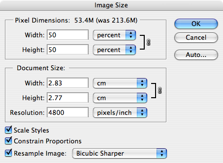
Downsampling from 4800dpi to 2400dpi
And here we have the "final" image at the proper size, and with the proper tones. Note that the histogram is perfectly smooth, there is zero banding since we had so much more information in the 4800dpi image than was needed to make a smooth 2400 one.
At that stage, I can do the sharpening to get a step further toward the final image. As a side note, look at the relative size of that chain link in the screenshot, compared to its size in the total image. The image is huge (25 megapixels) and we have pixel-level details and virtualy no grain.
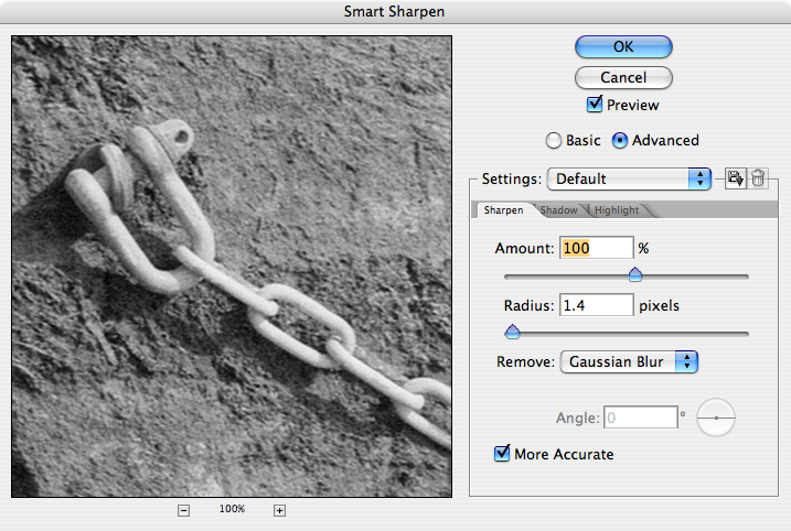
Gentle "Smart Sharpen" on the image
Next is another trick of the trade. Earlier I "reined" back on the enthusiasm about contrast for a reason. The reason is that I can enhance the local contrast instead of the general contrast. This enhances the apparent contrast and sharpness, makes the image a bit more "punchy" but doesn't makes mushy shadows. This step is very subtle and need to be done carefuly, it can "blow" some highlights that I worked hard to keep in check.
The trick is to use the "Unsharp Mask" filter with a very large radius (50 or so) and a low amount (20% is a good value usualy) then play a bit with the "threshold" between 1, and usualy 4. You have to experiment a bit with this, but remember than it needs to be subtle; too much of it can destroy an image.
Here is the result, and look that the next image to see the difference it makes. This effect is also known as "anti haze" filtering; you can see why when looking at the contrast on the bridge's pilar.
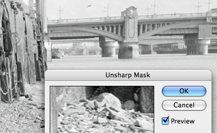
"After"
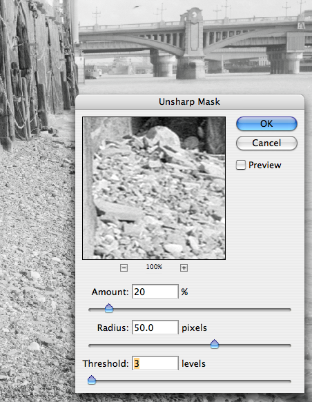
"Before" and the settings
There we are, now the black and white image is finished! The next steps is to convert it into an image that is "useable" both on commercial printers and on the web.
The main problem with black & white JPEGs is that the "color" profiling is not standard; there is no equivalent to the "sRGB" profile to fall back to. So after a lot of experimentation my conclusion is that you are better off doing the conversion to sRGB yourself instead of the ramdom display you will get. Or the guesstimating of a printer.
Thus the last steps are always to convert the image to 8 bits, then convert it to RGB colors, and then to "Convert to Profile" to sRGB before saving the JPEG file at it's final size.
Technicaly, to preserve a maximum of precision, I should first convert the "colors" THEN switch to 8 bits at the very last. Practicaly you are multiplying the size of the image by 3 when converting to RGB, so you need a fantastic amount of memory to do that step, this is why I usualy "cheat" and convert it to 8 bits first...
Note that it is only at this stage that the "apparent contrast" profile I was using is used to touch the pixels and make the final image; before that step we were still using a "virtual contrast", this explains why the sharpnening didn't "pick up" on the grain and noise; as far as the sharpening was concerned, the image was still very very smooth.
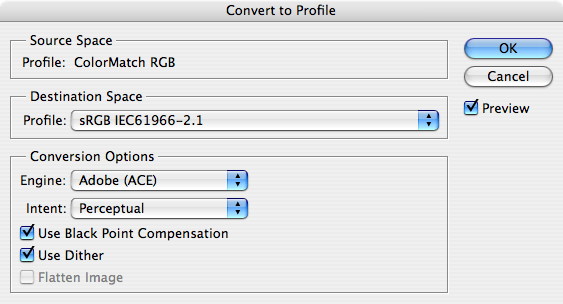
Convert to sRGB for web & printer
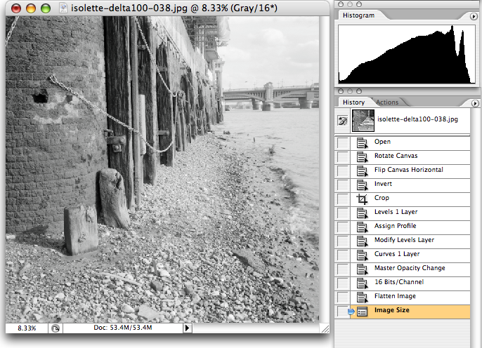
And there we are, the final image, with the complete history. The "jaggies" in the histogram were created by the sharpening and are perfectly normal.. But there is no banding, of course.
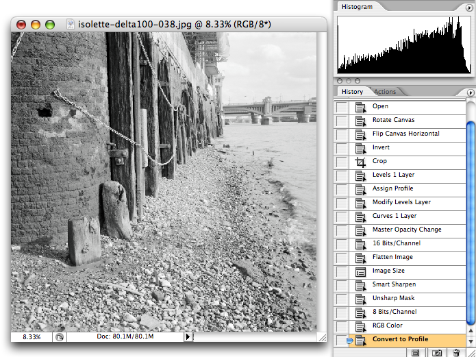
Final Image with history.
I hope your enjoyed this tutorial and that you continue shooting film, developping it in arcane formulaes and scan them for everyone's pleasure!
© Michel Pollet, 2006. All images and text are property of the author and are not to be duplicated or reprinted without permission.